You do have to work hard at crafting the best blog design you can to make visitors comfortable. Most consumers are less likely to return to a site after a bad experience according to recent studies. To start with, stick to basic principles applicable for modern blog design.
Top 5 tips for creating an incredible design for your blog
Design plays an integral part in creating the right first impression and enticing visitors to explore a site further. The wrong design can be off-putting, making visitors leave your page altogether. Let’s go over some tips and tricks to make your blog look appealing to visitors.
Use white space
Leave some parts of your blog blank. This blank space is also known as white space. It’s necessary to help your readers focus their attention on what’s important on your page. If your page is cluttered, readers can get lost and be confused. Every important element (a call-to-action button, content, or ads for instance) should be surrounded with white space to catch the eye.
Limit fonts and colors
Design ideas can be multiple, but you should watch out and use only those colors and fonts that really matter and reflect the essence of your blog. There’s often an urge to implement all the fonts and colors at once. Too much variety can hinder the focus and confuse audiences. Stick to a color scheme that reflects gradients of one shade. Pick three colors in the same category or those that create contrast without overwhelming readers.
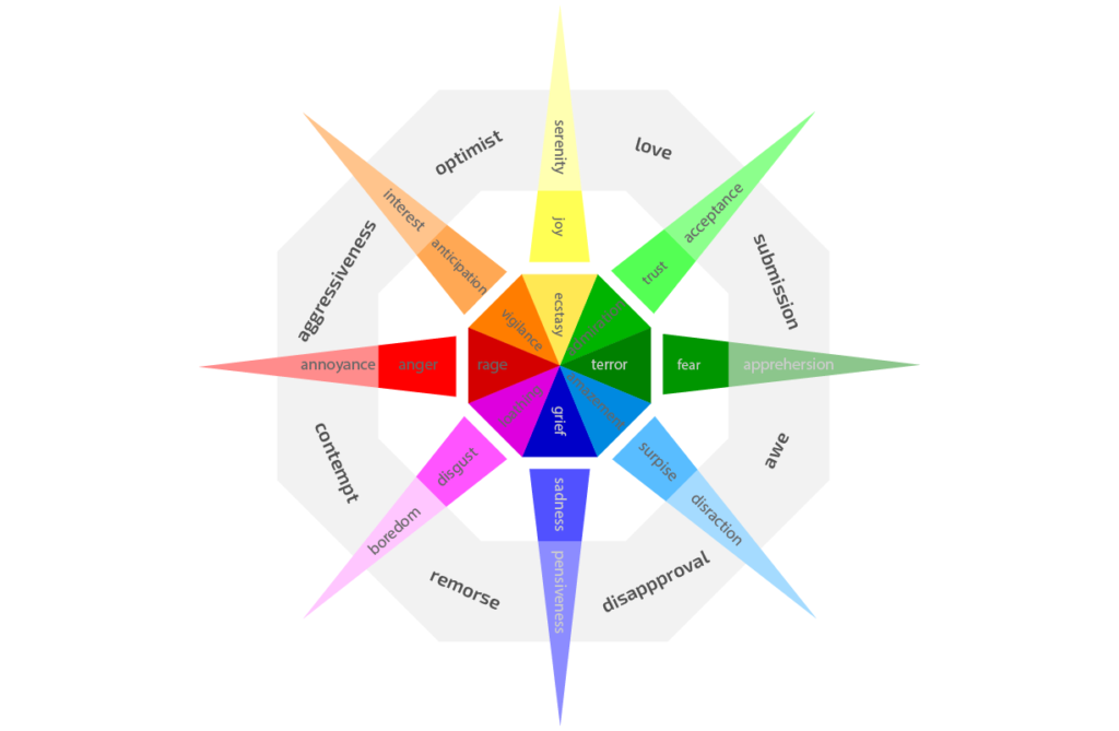
Robert Plutnick created a color wheel that talks about emotions each color shade can evoke in users.

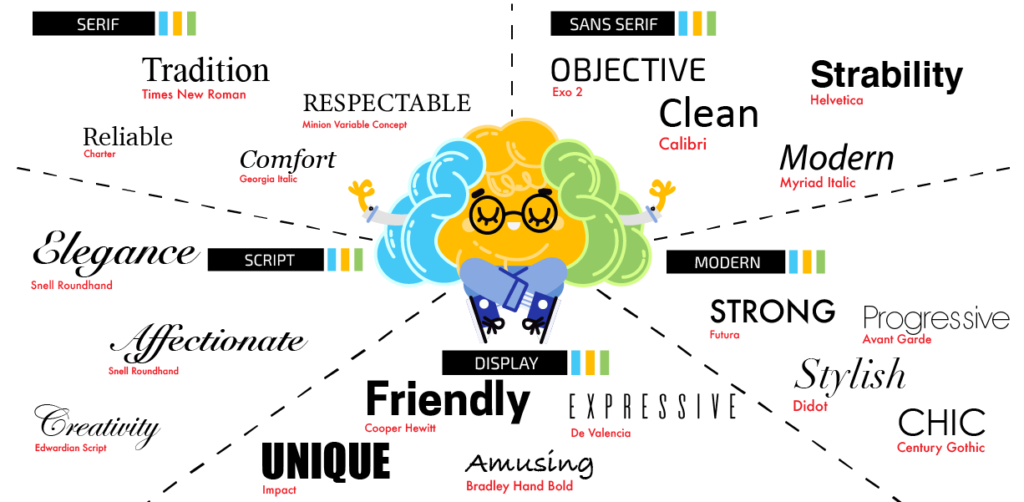
Just as colors have an impact on readers, so do the fonts you use. Select the fonts that communicate aesthetics and represent your niche effectively. You can choose one for your headlines, the other one for the text, and the third one can be used for the logo. Each font influences the recipient’s feelings and helps create meaningful associations.

Be minimalistic
Avoid creating messy pages and adding too many elements. Stick to minimalist and clean design. Place your text in the center. If you’re running an ad campaign on your blog, leave space for ads either on the right or left. Let your readers feel relaxed and help them focus on the content.
Make navigation clear
People expect certain things from a website, which is why navigation should be easy and clear. For instance, when clicking on your logo, it should take the visitor back to the homepage. Put the most essential pages in the menu where the header is. The elements you can put in the header may include the About page, Contact page, Shop page, Subscription page, or any other critical to your strategy page. Other minor elements such as the Donate or Archive button can be placed in the footer.
When you are designing navigation, try to create it with your chosen demographic in mind and their browsing habits. According to Pew Research Center, Millennials, Gen Xers and baby boomers are now using mobile devices more than ever. That’s why your blog should be optimized for mobile and look good across all screens.
Custom logo and great imagery
Logos are an integral part of building up brand recognition. You should come up with a unique logo that will set you apart from others. Besides building a recognizable brand, logos will come in handy when you start your social media campaigns. You can place logos on images, videos, or other things you’ll be posting. Logos come up in search results when visitors will be reaching out to you via mobile devices. If it’s too expensive for you to hire a logo designer, you can use a free logo generator created by Hatchful. It will run you through a quick questionnaire to craft a better logo.
Translating a blog idea into a workable design
Take the design process seriously and create a prototype. A prototype is a clickable version of an application or website. The predecessors of a prototype are wireframes and mockups. These three go together: 1) wireframes; 2) mockups; 3) prototypes. You should follow the order though if you want to achieve better design results and save time. (More haste, more waste you know).
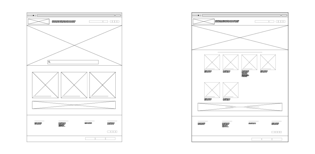
With wireframes, you get to structure the blocks your would-be blog will have. As a rule, wireframes are lines, text and geometrical shapes that are structured to represent the layout. Axure is one of the tools that can be used to create wireframes.

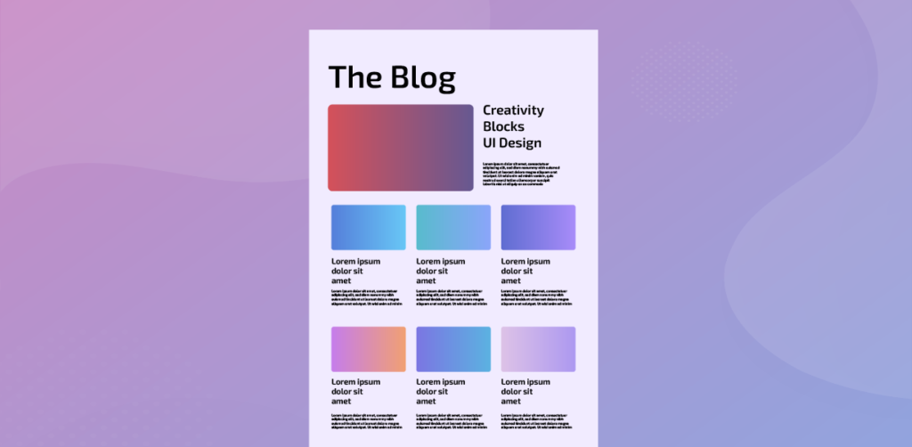
After that, you can create mockups using Sketch for instance. While wireframes are usually gray and white schematic representations of a future website or app, mockups leverage color, typography and spacing to come up with the exact feel and look of a website or app (interaction-free for now). At the stage of creating mockups, you can experiment with the layout until you are feeling confident about your design.

As soon as you finalize your layout, you can create a prototype that can model user experience on your blog. You can use Sketch or InVision for this. At this point, changes are problematic since you’ll have to rethink your structure. Decide what you really need while still working with mockups.
Your own design efforts
If you want to be the maker of your own blog, you are more than welcome to do that. In the case your blog is built with WordPress, utilize WordPress website builders to speed up the development process.
How to work with WordPress website builders
Technically, website builders are created for novice users who have little to no coding knowledge. Users can create a website of any complexity using ‘drag and drop’ features provided by website builders. Having a well-updated code base and comprehensive documentation, Elementor vs. Divi vs. Beaver Builder vs. SeedProd are considered the most popular and widely used tools that help tens of thousands of individuals get their sites up and running. Here’s a table so as to compare the four website builders offer-wise.
Elementor vs. Divi vs. SeedProd vs. Beaver Builder
| Elementor | Divi | SeedProd | Beaver Builder | |
| Starting price | $49/year | $85/year | $31.60/year | $99/first year |
| Demo version | – | + | – | + |
| Free version | + | – | + | – |
| Free trial | – | – | – | – |
| Initially created for | Web design | Any Websites | Landing pages | Any websites |
| Templates | 300+ | 800+ | 100+ | about 80 |
| SEO-powered | – | + | – | – |
| Real-time editing | + | + | + | + |
| Responsive | + | + | + | + |
| Supported languages | Volunteer- based translations | 32, including right-to-left languages | Built-in multi-language feature | Volunteer-based translations |
The main idea behind these website builders is to make blogging for beginners easy — you can either design a blog from scratch or pick a template to get you going — no coding required. Each tool has its strengths and downsides. Everything depends on your needs and skill set.
Divi
Divi is devised in a way to let anyone design a site while also seeing how things are structured. There’s no need to interfere with the code. You just work with the interface and layouts. It’s like drawing a picture and tracking your results in real time.
| Pros | Cons |
| Multiple designs. You’re welcome to experiment with multiple designs which you can save. This is very helpful in cases when you’re in two minds which design works best. | Options are overwhelming. It can be a little scary for some to find a way in the multiple options Divi offers. |
| Speedy revisions. You can easily redo and undo things as well as revise your design process. | Hardly portable. If you decide to move your content elsewhere, it will be highly improbable. |
| High customization. You can edit anything you want by clicking the element. Buttons, copy, and images can be edited. |
Elementor
Elementor is a WordPress-enabled website builder that helps you create websites without having to write code.
| Pros | Cons |
| Search option. Elementor has a special search tool to help you find whatever page or feature you’re looking for. | Limitations in the free version. You can use the free version of Elementor, but it sets limitations on what you can do with it. |
| On-going project. There’s a team of developers who want to bring this website builder to perfection by constantly adding new features and perks. | Lengthy learning curve. Elementor is hard to get used to. Before you begin working with it, you have to get to grips with it. |
| Integrations. Dozens of integrations are possible with Elementor sites. You can add AWeber, Mailchimp, Facebook SDK, Google Maps, YouTube, Vimeo and more. Additionally, you can leverage third party add-ons and create your own integrations. | Issues with the editing mode. Sometimes the website will look different when in the editing mode. This can be frustrating for some users. |
Beaver Builder
Beaver Builder is a web page builder that allows you to create responsive websites. You don’t have to know how to code due to Beaver Builder’s drag and drop feature.
| Pros | Cons |
| Ease of use. Beaver Builder is absolutely easy to install. You will spend little time learning it and can use it right away. | High price. The website builder is on the pricier end. The least you end up paying is $99 per year and the most is $399 per year, depending on the plan you choose. |
| Real-time user interface. There is no need to switch from the admin panel so as to see the changes you’ve made. You can track everything in real time. | Lack of modules and templates. Beaver builder seems to lack modules and templates as opposed to its competitors like Elementor or Divi. |
| Different modules. Content can be of various types such as videos, photos, slideshows and more. Beaver Builder supports them all with the abundance of modules. |
SeedProd
Without having to code, the beginner-friendly SpeedProd landing page builder lets you create landing pages, sales pages and more.
| Pros | Cons |
| Visual. SpeedProd uses a drag and drop feature making your page creation visual. You can preview pages easily in real time. | Limited focus. While other page builders have a wide variety of things you can build with them, SeedProd focuses on building landing pages rather than blogs. |
| Customizable. You can modify the design of a template in a few clicks. The things you can change include color, alignment, font, text, size and much more. | Limited free version. The free version unfolds basic features. You can’t test the full potential of the web page builder. |
| Email integration. Some tasks like sending out email to multiple readers can be simplified when connecting to a mail service. SeedProd can help you integrate with MailChimp, ActiveCampaign, ConvertKit and more. |
To choose the right website builder, align your budget with your development goals. Each of the website builders lets you test it either through a demo version or a limited free plan. Having tested each tool yourself, you can understand which one to choose.
Best WordPress theme for blogging: Astra vs. GeneratePress
Now it’s high time to speak about a free blog WordPress theme that can seal the deal for you. Actually, there are two that stand out and they are Astra and GeneratePress.
Astra theme
Astra is a WordPress theme made for blogs, portfolios, business websites as well as WooCommerce platforms. Astra’s free version is limited. Nonetheless, you can unlock awesome features if you pay for the Pro version.
The theme weighs less than 50 KB, which makes it lightweight and adds to the overall page speed. Additionally, the theme is optimized for SEO and mobile pages (AMP).
Astra is compatible with Beaver Builder, Elementor, Divi, Visual Composer, and many more. This means you can import the theme on top of a page builder to change the look and feel of your site.
The theme gives you access to over 100 pre-built website templates. Not only are most of them free, but they are also standalone sites with essential pages, features and plugins combined in one package.
GeneratePress theme
GeneratePress is a multi-purpose WordPress theme that weighs only 30 KB when installed. Since GeneratePress is a freemium blog theme, you still get a few essential features to start a seamless blogging experience with. If you want to extend functionality, you can opt for the GeneratePress Premium theme, which is technically a plugin to help you customize your site and add functionality that corresponds to your business logic.
GeneratePress has a clean design and works well with Elementor, Beaver Builder and other WordPress themes. The free version gives you a chance to play with basic customizer settings, test widget options as well as different colors and typography. If you want to customize your site with the help of Hooks and Filters, you have to be familiar with coding.
Which blog theme is good
Both blog themes are the top choice for those who want to start a publishing platform. If you plan to use a free version, then Astra can give you more functions than GeneratePress’ free plan. To design a simple blog, you can go with GeneratePress. However, if you want to leverage integration, a faster site, and customizations, try Astra.
Design is a delicate thing since your blog’s success depends on how well it looks and feels. The two pillars of web design are user interface (that is how a web page looks) and user experience (that is how well you can navigate a web page). Unless you know UX/UI principles or are natural at aesthetics, it may be hard to craft a stunning design. You might as well delegate the task.
How to choose a well-qualified blog designer
If you hardly have an eye for design and find creating a blog layout rather daunting, it’s worthwhile to look for a graphic designer to get the job done for you.
Pitch your idea
Before you contact any graphic designer, you need to jot down a few things. First and foremost, you need to identify your key needs. Let’s say you need a blog to write about digital products. Think of the timeframe and budget you’re ready to spend on crafting your blog’s look. When you pitch your idea in front of a designer, it should sound like this: “I need to design a blog where I can write about digital products. I need the work to be done in two weeks and I am ready to spend $450-500.”
Look for a designer locally or across the web
After you have your pitch ready, you can start looking for the perfect graphic designer. In the case you can’t find a designer locally, it’s wise to look for one online. Some platforms such as UpWork, Freelancer, or Fiverr feature designers with varying experience and expertise. The aforementioned platforms give you an opportunity to view creatives’ profiles, but it may not be enough. You should interview designers and ask them to showcase their portfolios in order to see their work. The colors, typography, and layouts you’ll see in those portfolios give you an idea of a designer’s skill set.
Identify the designer’s work process
You should definitely ask the candidates about their design process to better understand how they work. If you hear the following things, it means you’re on the right track. Your designer should:
- Research the target market, colors that can be applicable, and corresponding typography;
- Sketch the design;
- Provide computer-aided design;
- Receive approval from the client;
- Give the final presentation with the project deliverables.
Inquire about the skill set
Each graphic designer’s skill set varies, but there are some basic things they should know. Let’s go over them. A good graphic designer should:
- Understand basic UI/UX principles
- Have a good grip of such tools as Illustrator, InDesign, and Photoshop
- Be familiar with HTML
- Have an eye for a well-structured layout
- Have good knowledge of layout and typography
- Be creative and have out-of-the-box thinking
- Have basic knowledge of art theory
- Show good communication skills
Create an assignment for the designer
While creating an assignment for a graphic designer, you have to be as specific as you can because it ensures 50% of your success. Guide designers you want to work with the following way:
- Specify your timeframe and budget.
- State your mission and uncover the brand identity.
- Say what you want to communicate to your audience (power, knowledge, entertainment, etc.).
- Provide your designer with some examples of similar blogs that inspire you.
- Say what navigation tabs you need and how many pages your blog will have.
- Say if your blog needs to be divided into categories and what they are.
- Express what you want to see on each page with posts.
- Indicate which social icons you want to place.
- Find the time in your schedule to review the work done and give constructive feedback as far as design goes.
Ask candidates to give you a price quote and portfolio. This will help you find balance and choose an option that fits your needs and meets the budget restraints.
The time needed to deliver a fully functioning blog depends on the tools the designer is equipped with. If you need to go live ASAP, a blogging platform or CMS can be used. However, if you have resources and time, you can develop a custom blog, which may take you 1,5+ months.
How to design a blog on WordPress: Components and costs
Once you choose to design a blog with WordPress, you need to know how much it will cost you. The components you’re likely to be paying for include: domain name, WordPress hosting, themes and plugins. Plus, you’ll have to think about the security and protection of your blog.
However, let’s keep the focus on the WordPress design costs. First and foremost, ask yourself the following questions:
- Am I good with regular blog design? Or do I want it to be unique? (The price you’ll end up paying will depend on whether you choose free or premium themes).
- Am I satisfied with the features a plugin offers? Or do I need the features and functionality that require a developer to step in?
- Do I need to design a blog from scratch because there’s a special logic behind it?
- How do I want my content to be structured? You have to think about your content and how it will appear to users so as to keep them engaged and coming for more.
After answering these questions, you can understand which blog designer you need to hire. If you turn to an agency, either in-house or overseas, it will cost you a penny. Freelance designers will charge less. For instance, a freelancer may charge you under $500 to make some tweaks like modifying themes and templates, adding social media buttons, or uploading plugins. In case you need some minor alterations, there’s no need to ask an agency. Agencies will cost you more of course. Be ready to pay $1,000 and more. It all depends on what your design specifications are.
How to start a blog with the best design principles in mind
Every element on your blog is important and should load fast. To achieve top speeds and deliver supreme navigation, make sure your blog has fast hosting. At HostPro, we offer WordPress hosting if you have a WordPress-powered blog and web hosting for custom solutions as well as other platforms and CMS. Take advantage of NVMe-based hosting offered at HostPro and have a team of tech experts to help you out 24/7.