You are in distress because your online banners get just a few clicks? It can be that your banner needs to be improved.
Banners are everywhere and the goal is to make yours as enticing and clickable as possible. Business Insider says that people are more likely to survive an airplane crash or give birth to twins than click an ad. Let’s prove the stats wrong!
Translate your business goal into a great banner
Focus on your business goal in the first place. You need an online banner to:
- generate traffic
- increase conversions
- grow brand recognition
- generate more leads
- … or all of the above?
There are some common guidelines you can follow to make an effective ad.
Craft a short CTA
Especially if you want users to complete an action (get converted) after they’ve seen your banner, place a call-to-action (CTA). CTAs motivate visitors and tell them what they actually need to do. CTAs should drive people to your site, namely to the web page that further compliments your banner. The discrepancy between the banner and the page can confuse and misguide the visitor.
Make your banner appealing
You can make the images you use on your banner more practical and applicable, appealing to the visitor’s imagination. Let’s say you need to advertise a book. Instead of putting a book on some background, depict hands that are holding that book. If you market foods, place the sample on a plate. Visitors can imagine that it’s their hands holding that book or it’s their plate your product is on.
Animation is also a great way to catch the visitor’s eye since human eyesight focuses on things that move.
Keep your banner simple
To make your key message clear and visible, use a lot of blank space around it. If you place tons of information on such a small space as an ad banner, the visitor can hardly focus their attention. Not only will your banner look weird, but it can overwhelm the visitor, turning them away from the banner.
Use colors that matter
When coming up with a color scheme for your banner, make sure you stick to those colors that make sense for your brand (we’re not considering logo colors here). You may want to make it bright, however, it can repel visitors. Think audience-wise to be able to choose the right colors. If you’re selling video games, make your banner dynamic and bright. If you’re a digital agency, think of subdued and noble colors that communicate your brand status.
Hard to find inspiration for the right color? Choose your brand colors as an option. That way users may easily recognize your brand behind the colors.
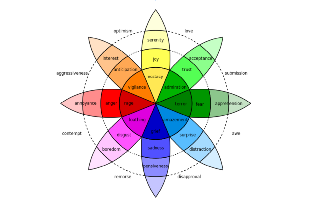
Every color evokes certain associations and emotions. Think about the emotions you want to trigger and then choose the color. Robert Plutnick created a color wheel that talks about emotions each color shade can evoke in people.
Create a succinct text copy
It takes a fraction of a second to look at the banner and decide whether or not you linger on more. A fraction of a second is all you’ve got to deliver your key message through the text copy on your banner. The ideal ratio is one banner equals one key message with a length of 2 to 10 words.
You can also break down your message into headings and subheadings, making your text memorable. What’s more, your text fonts must be consistent. Stick to one or two fonts to help the visitors read your message quickly, increase the trustworthiness of your banner, and maintain clear focus.
When you place both images and text on your banner, choose the appropriate position. The human brain has the left and right hemispheres each responsible for different kinds of perception.
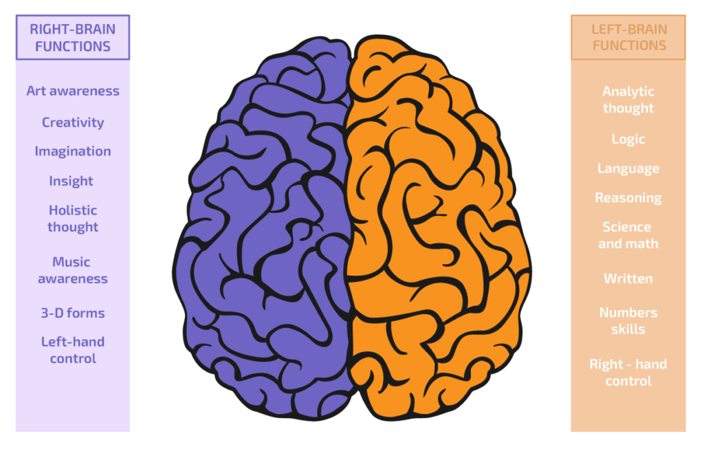
To help visitors digest your banner in a fraction of a second, distribute your text and image with this anatomy principle in mind.
Use people on your banner
Sometimes, you can use images of people on your banner. If you decide in favor of adding people, remember the following.
You can put two objects together and create an intangible connection between the two objects. You can add more value to your product if you place an image of a person smiling next to the product. By doing so, you can create a positive effect and make the visitor more lenient to your product.
You can also let the image of a person on your banner motion towards your product or CTA. This kind of image can provoke the natural instinct to look where you’re pointed to. Not only can images of people point to the focal point on your banner, but also the lines and other graphic elements you decide to utilize.
By keeping to these simple guidelines, you will make your banners clickable and your site can enjoy increased traffic.
When traffic goes through the roof
If your advertising campaign is consistent and banners bring tons of visitors, your site may break down because it’s not ready to welcome the visitors and handle all user requests or transactions. To avoid downtime and help the site respond, we offer NVMe hosting. Our NVMe-enabled hosting lets your site experience supreme productivity and can handle tons of simultaneous users.